Pastel vs Watercolour: What’s the Difference?
This page introduces pastel media and explores how it differs from watercolour, helping you understand the unique character of each. You’ll see how pastels offer rich, velvety colour and beautifully defined detail, while watercolour brings a softer, more fluid transparency to an image. Whether you are commissioning a portrait or simply curious about the medium, this guide reveals why pastel has such a timeless and expressive appeal.
What Is Pastel Media?
Pastel is a painting in chalk with a soft and detailed finish. The technique allows for a sense of movement and animation. 19th Century artist Edgar Degas and impressionist Mary Cassatt produced some of the finest pastel paintings.

"Henry" (2018, pastels)
One of my cat commissions
This is my preferred medium for portraiture. I use a combination of Rowney soft (chalk) pastels, which have bright colours and can be readily smudged and blended for background work, and Stabilo pastel pencils, for the finer detail, working on Canson fine art paper.
When a soft pastel work is finished, it is not smudge resistant, so care should be taken with the painting. Some artists will use a fixative spray which creates a permanent bond with the pigments and paper. However, I do not recommend this approach as it leads to discolouring. Instead, I advise framing the work with a mount behind glass. This method will preserve the painting for many years to come, and retain the original colours used. When hung, pastel paintings should not be displayed in direct sunlight, as this can result in the pigments fading.
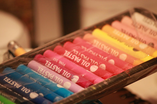
oil pastels
Oil Pastels
Oil pastels are different to the traditional chalk based pastels used by the 19th Century Impressionist masters. They were first developed in the 1920's in Japan as a child safe-alternative to soft pastels, and are also called "Cray-Pas". Later in the 1940's, Henri Sennelier was approached by Henri Goetz on behalf of his friend Pablo Picasso to develop a high grade version of oil pastels suitable for professional work. Picasso explored the vibrancy and richness of this medium in works such as "Paloma l'orange"((1951) and his series of artists at work e.g. "The painter II" (1963). These paintings demostrate the immediacy and boldness that is possible with oil pastels. Whilst less susceptible to accidental smudging, oil pastels still need to be protected from damage by either fixative spray or framing.
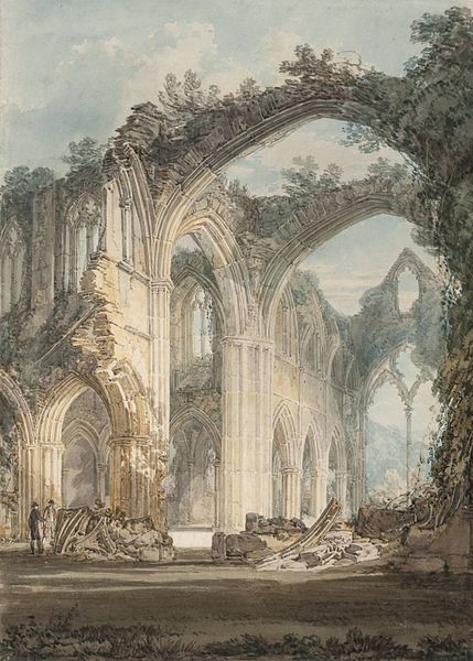
"Tintern Abbey: The Crossing and Chancel, Looking towards the East Window."
J.M.W Turner (1794, graphite and watercolour on paper. Photo in the Public Domain.)
Watercolours are paints in water soluble pigments, usually applied to paper. The rapid drying times involved allow for a spontaneous feel and the capturing of fleeting moments. Famous artists who used watercolours are J.M.W. Turner and James McNeill Whistler. One of Turner's most notable examples of watercolour is "The Blue Rigi, Sunrise", which is part of series of three paintings by the artist that depict the shifting light and transitory nature of the French Alps. Whistler's work illustrates how watercolour can bring movement to life through it's sketch-like nature, for example, in the sublime "Note in Pink and Purple–The Studio"
How are Watercolour Paintings is Created?
Watercolour works are created by a process of layers. To begin with, light washes of colour are applied to the paper to create the sky and background. Once dry, further wet layers of more concentrated pigment are added to create depth to the work. Next, detail is added by using a brush with less water and more paint on dry paper (known as "wet-on-dry" technique). The darkest tones are usually added at the end to create contrast and depth.
Key Differences: Colour, Texture, Technique
When choosing between pastel and watercolour, it helps to understand what makes each medium special and how they behave on paper.
Pastels
• Made from almost pure pigment with very little binder, applied dry to a textured surface.
• Produces beautifully rich, velvety colour with soft blending and fine detail directly on the paper.
• Layers can be built gradually, creating depth, realism and a strong sense of presence.
• With no liquid involved, colours remain vibrant and true over time.
• Because pastel sits on the surface rather than soaking in, it can smudge if touched and should always be protected behind glass once finished.
Watercolour
• Pigment is mixed with water and brushed onto paper, where it flows and settles into the fibres.
• Creates transparent, luminous washes with a light, airy feel.
• Ideal for atmosphere and subtle transitions, but less forgiving than pastel.
• Once paint is laid down, mistakes are difficult to fully correct.
• Colours appear softer, as the white of the paper shows through every layer.

• Pastel offers strong colour, texture and detail with a beautifully painterly finish, making portraits feel vibrant and full of life.
• Layers can be built gradually, allowing subtle nuances of fur, eyes and expressions to be captured with lifelike depth.
• The ability to blend directly on the paper with pastels create soft transitions, gentle highlights, and realistic surface detail.
• Watercolour excels at lighter, airier impressions, producing delicate washes and transparent tones that suggest light and atmosphere rather than detailed texture.
• Watercolour is ideal for looser, more ethereal artworks or studies focused on mood and subtle effects of light.
• For commissioned portraits where realism and personality are the priority, pastels are my preferred choice, and will retain their vibrancy over time when framed behind glass. I love pastels because they allow me to capture the subtle textures, expressions, and warmth of each subject in a way that feels immediate, tactile, and full of life.
Ultimately, the best medium depends on the style and effect desired: pastel for rich colour and realism, watercolour for softness, transparency, and fluid light.
How To Care for a Pastel Painting
• When the portrait arrives it should be framed with a mount behind glass as soon as possible. This will prevent accidental smudging of the media. Keep in mind that pastels are chalk based. Never touch the surface of the work - always handle it by the edges before framing.
• I do not advise using a fixative spray. These tend to discolour the work over time.
• Avoid hanging your work in the path of direct sunlight, and also keep your portrait away from fluorescent lighting. Both contain ultraviolet light which will damage and fade the pastel media.
• I post all my works out by Royal Mail Special Delivery. In the unlikely event of damage or loss, the work is insured during transit. If the portrait is not recoverable I will create a new portrait for you free of charge.